
URL: https://www.desy.de/school/school_lab/zeuthen_site/cosmic_particles/cosmicweb/documentation/index_eng.html
Breadcrumb Navigation
Cosmic@Web Documentation
Cosmic@Web - Documentation

Welcome to the Documentation, the guide for Cosmic@Web. Here you will find explanations on how the settings work as well as useful tips. A description of the experiments, of which the data is made available to you for evaluation via Cosmic@Web, can be found on the main page. If you are looking for an interactive guide to using Cosmic@Web, click the link to the tutorial.
With Cosmic@Web, cosmic particle data from various experiments can be analysed. Data from the detectors at Neumayer Station III, on the research vessel Polarstern, at the Schneefernerhaus on Zugspitze, and from the SEVAN detector network can be used to study the rate of cosmic particles at various locations around the world. Furthermore, data from different cosmic particle experiments and a Weather Station installed at DESY in Zeuthen can be analysed. The angle dependence of the muon rate is investigated with the CosMO-Mill, the decay time of muons is measured with LiDO and the Trigger Hodoscope takes continuously muon and shower data.
To make it easier for you to find your way around, we recommend opening the manual and Cosmic@Web in two separate windows of your web browser and placing them side by side on your screen.
Table of Contents |
Diagram Creation and
Setting of Detail Level
Cosmic@Web offers two modes to define the detail level for the creation of diagrams.
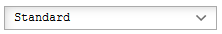
The Standard mode makes it easy and quick to get started by reducing the setting options to the essentials. Select this mode if you are new to Cosmic@Web or want to perform a quick analysis.
Beginners should start with the Tutorial. If you already know your way around, want to deepen an analysis or customize the presentation, select Detailed mode. This mode offers you a wide range of settings.
Data Array
In the section Data Array, all relevant settings to analyse and display the data are made. The section Choose Data allows the selection of the experiment, the data set, the diagram type and the variables. In the section Data Analysis the conditions for data reduction and fit functions can be defined. The last section, Presentation Option, enables the definition of size, colour etc. of the data points in the diagram.
Below, you will find explanations of each individual setting option. Note that some of these options are only available in the Detailed mode.
By clicking the button  , you can add up to three more data arrays that are displayed in the same diagram. The button
  can be used to remove a data array.
Choose Data Set
Select the experiment and the data set you want to analyse. Specify with which diagram type you would like to use.
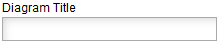
Enter the name of the experiment and the data set. This is displayed in the key and helps you separate the data if you want to display several data arrays in one diagram.
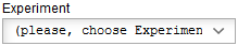
Choose the experiment you would like to analyse. A description of the experiments can be found at Cosmic@Web.
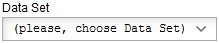
After selecting the experiment, the data set you wish to analyse must be selected. A list can be found under the available Data Sets [Link]
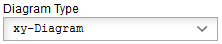
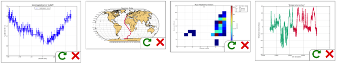
Here you select the type of diagram you want to display the data in. Different diagrams have different benefits, and the different options are explained in the following table.
 Table of Presentation Forms
1D-Histogram |
Presentation of a single variable, e.g. particle rate, atmospheric pressure, temperature. This variable is represented on the x-axis. The y-axis shows the amount of times the variable has occurred. |
|---|---|
xy-Diagram |
Presentation of the dependence of a variable on one or (optional) two other variables. An example is the dependence of the particle rate (y-axis) on air pressure (x-axis) |
2D-Histogram |
Displays the dependence of one variable on another. The frequency of the first variable is depicted as a colour scale. |
Profile |
The profile representation is similar to the xy diagram. However, not every data point is displayed separately. The mean value of the y-values is calculated according to the number of x-bins for each bin and represented by a horizontal line. The x error therefore represents the width of the bin. The error of this mean value, the y-error, is represented by a vertical line. This is the standard deviation (with 1σ). |
Map |
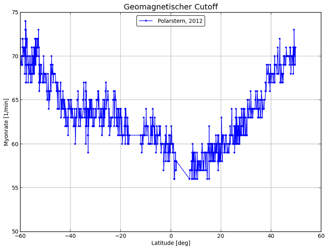
For the representation of the geographical coordinates of the Polarstern position. Optionally, an additional variable can be displayed in scaled colors (e.g. particle rate, air pressure, temperature) depending on the coordinates. |
Choose Variables
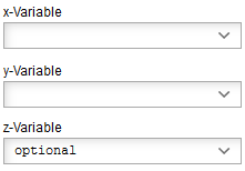
Depending on the diagram type up to three variables can be chosen. All variables available
for the selected experiment are shown in the drop-down menu.
The z-variable is optional, it is not necessary to select it to create a diagram.
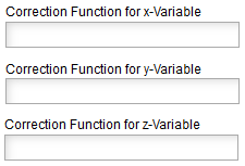
The corresponding variable can be modified with the correction function. If the space is left empty, the variable is shown in the measured unit. Examples are the transformation of the variable "time" from second to day (time/(24*60*60)) or the air pressure correction of the particle rate.
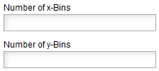
In histograms, the frequency of a variable is given within intervals or so-called bins. The width of the bins, i. e. the length of the intervals, is calculated as the quotient of the entire measuring range and the number of bins. For example, the division of a measuring range of 15 s into 5 Bins results in a bin width of 3 s. With a sufficient statistics smaller bins can also resolve smaller structures. However, at lower statistics one can compensate statistical fluctuations in the distribution by choosing a larger bin width.

Real measurements are always faulty. When selecting this option in addition to the measured value the statistical error of the corresponding variable is also displayed in the diagram.
Data Analysis
Once the data has been selected, settings can be made in this section to analyse the data. Data can be filtered according to certain quality characteristics or other conditions. The fit procedure checks how closely experimental data can be described by a mathematical function.
Data Reduction
To define filter (cut) conditions, the following signs can be used:
== equal
> larger
>= larger equal
< smaller
<= smaller equal
and and
or or
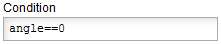
Example: The particle rate should be displayed if the temperature is 20° C or higher and the air pressure smaller than 1000 hPa.
The condition is: T_a >= 20 and p<1000.
Fit
In some cases it is necessary to describe the experimental data by means of a mathematical function. This fit procedure yields the function parameters for the best representation of the given data. Read more about fit functions in the glossary.
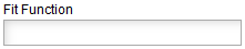
In this field, enter the function that you would like to use to visualise the data. A function can have several free parameters, which are marked with p[#]. The symbol # is replaced by a number to identify the parameter, whereby the parameters are numbered starting from 0. The independent variable is designated x and corresponds to the x-variable selected from the data set. There are various mathematical functions, that can be used. The values of the parameters resulting from the fit are displayed in the diagram. Examples of fit functions are listed in the table below.
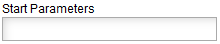
To enable a fit of the function to the data, the start values of the free parameters should be assigned to
values which are in the range of the expected magnitude.
The values are separated by a comma and successively assigned to the parameters according to their numbering.
Note: Decimal places are separated by dots and not by commas.
Fit-Function |
Explanation |
Start Parameters |
|---|---|---|
p[0]+p[1]*x |
1.5,0. |
|
p[0]+p[1]*exp(-(x/p[2])) |
5000.,100000.,2.2 |
|
p[0]*exp(-(x-p[1])**2/p[2]**2) |
50.,1000.,10. |
|
p[0]+p[1]*cos(p[2]*x/180*pi)**2 |
50., 500., 1. (e.g. for experiments on zenith angle dependence with the CosMO-Mill) p[0] - distribution minimum p[1] - distribution maximum p[2] - phase |

Presentation Options
In this section, you can customize the graphic design of the diagram as you wish. Different options are available in the diagram depending on the previously selected type of diagram.
There are different ways of displaying the data in a 1D histogram. You can choose from the following:
Histogram,
Histogram filled,
Line,
Line filled,
Scatter.
There are different ways of displaying the data in a 2D histogram. You can choose from the following:
Colour,
Contour filled,
Contour filled,
Box filled.
Various statistical values can be output. The choices are:
a = everything
n = number of entries
u = underflow
o = overflow
m = mean value
s = standard deviation
at 1D: p = mode (most frequent value), e = median, w = skew, k = kurtosis, x = excess
at 2D: c = covariance
It is possible to define a number of contour lines, i.e. the number of ranges into which the measured frequencies are divided.

If this element is activated, the probability density, i.e. the distribution of events normalized to 1, is displayed instead of the number of events.
In the cumulative display of a histogram, the sum of the binary entries is displayed. The summation can start from the left side of the x-axis or the right side.
There are numerous possibilities to display spherical coordinates on a flat, 2-dimensional surface. Some of them are available here.
If this option is activated, the history of national borders will be plotted on the map.
If several data series are to be displayed in a diagram, this option can be used to determine the sequence in which the diagrams are plotted on top of each other. This is useful to avoid one diagram hiding the other, e. g. if in a 1D histogram the bin of one record has more entries than that of another record.

The chosen symbols or line to display the data can be shown with a selected colour. An exception exists if a z variable is to be displayed. In this case, the symbols or the line are given a colour corresponding to the assignment of the value of the data point on the colour scale.
Another useful option when displaying several datasets in a diagram to avoid mutual masking of diagrams is to select the transparency of the symbols or line. Graduations between 0% and 100% can be selected, where 0% means completely opaque and 100% means completely transparent.
Data points can be represented by different symbols. If you have more than one dataset, it makes sense to use different symbols in addition to different colours.
The symbol size can be adapted to your own requirements. The entered value is read in millimeters.
If data points are to be connected by a line, the following line shapes are available:
solid line,
dashed,
dotted,
dashed-dotted.
The thickness of the line can be adjusted by a value in millimeters.
There are several options for the line style of the fit function:
full line,
dashed,
dotted,
colour red: 'r-',
colour blue: 'b-',
colour green: 'g-'
Diagram Options
After all settings have been made to determine how the diagram should be displayed, there are options for labelling and formatting the diagram in this section.
Give the diagram a name to find it among your saved diagrams.
The width and height of the diagram can be varied. The entered values are read in in centimeters.
Axes
By default, the axis is labelled with the variable set under Data selection including its unit and, if necessary, the correction function. This label can be changed in this field, which can help to make the diagram easier to understand.
Example: The muon rate should be displayed as a function of time in hours. By default, the x-axis is labeled "time[s] (time/3600)" according to the entries. For better visualization, the axis label can be changed to "time[hours]".
If only a certain section of the axis is to be displayed, the limits of the section can be entered here.
The correct axis scaling can simplify the recognition of correlations. Therefore, different scales are offered. The standard is a linear scaling with equidistant axis sections. This setting is useful for most observations. If the data span a large range of values (several orders of magnitude), especially if there is an exponential relationship between the displayed variables, logarithmic scaling is recommended.
Legend
The legend can be hidden or its position in the diagram can be changed so that it does not cover the graph or graphs.
As soon as all settings have been made, you can use the button  to initiate data processing.
If all settings are correct, the desired diagram appears under the heading Diagram. If something was entered
at a position that Cosmic@Web does not understand, there is an error message with the error description.
All settings can be reset to their initial value by using button
to initiate data processing.
If all settings are correct, the desired diagram appears under the heading Diagram. If something was entered
at a position that Cosmic@Web does not understand, there is an error message with the error description.
All settings can be reset to their initial value by using button  .
.
Diagram
Depending on the number of data sets and their size as well as the selected options, processing may take a moment. Provided all settings are correct, the diagram is displayed in this area after the Create Diagram command.
In case of an error in the setting, an error message appears instead of a diagram indicating where the error
occurs and what kind of error it is.
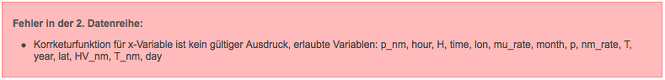
Example: Two data sets are to be displayed in one diagram. In both, the temperature is to be
displayed as a function of time in hours for different data sets of the Polarstern experiment.
To obtain the unit hours, the correction function time/3600 for the x-variable must be used in both data
series. The correction function x/3600 was accidentally entered in the second data series.
Since the variable x is not part of the data set, it is not recognized and the following error
message is issued:
Plot
Cosmic@Web offers several ways to save and access a diagram. Each time you visit Cosmic@Web, a new session
is initiated with a unique identifier, the so-called Session ID.
Using the button
 ,
the diagram and the associated settings are saved in this session (see: Saved Diagrams).
,
the diagram and the associated settings are saved in this session (see: Saved Diagrams).
A local copy of the diagram can also be created in three different formats (PDF, SVG, PNG) by selecting the
corresponding save button
 . A new tab in the browser will be opened where the diagram is displayed in the chosen
format. From there, you can save the diagram to your computer.
. A new tab in the browser will be opened where the diagram is displayed in the chosen
format. From there, you can save the diagram to your computer.
In addition you can store the settings to load it into another session and you can include the diagram into
a website.
Settings of the Plot
Under this item, all settings for the current diagram are specified in the text field. You can save it to your computer to use it later for other analyses. To reproduce the diagram this text field has to be copied into the field Load Settings. Thus, the same diagram can be easily generated in different sessions, e.g. also in another person's session.
Integrate this Plot into a Website
The contents of this text field can be used to link the diagram to an HTML file. The link, which is marked with quotation marks, can also be entered directly in a website to display the diagram.
Saved Diagrams
This section lists all diagrams stored under the currently loaded Session ID in thumbnail
view. Clicking on a thumbnail opens the diagram in large view. Clicking the icon
 reloads all settings for this diagram and generates the corresponding diagram. The icon
 removes the diagram from the list of saved diagrams.
Load Settings
To reproduce a diagram, copy its settings, which are displayed in the section
Settings of the Diagram or which you
have stored on your computer, into the text field below this section and use the button
 .
All settings are accepted and the corresponding diagram can be generated in the usual way.
.
All settings are accepted and the corresponding diagram can be generated in the usual way.
Session ID
Working with Comic@Web is connected to a session. A session corresponds to about one folder on the computer
and has a unique identifier, namely its Session ID. The Session ID of the current session is displayed in the
text field of this section. All diagrams created and saved during this session are assigned to this label.
By entering the Session ID of another session, you can load it using the button
 and access the diagrams stored there. Therefore, it makes sense to note down the identification of the
current session in order to be able to access it again later.
and access the diagrams stored there. Therefore, it makes sense to note down the identification of the
current session in order to be able to access it again later.
You can use the button
 to create a new Session ID and thus a new session.
In particular, it is also possible to give the session its own marking of at least eight characters.
After entering a new Session ID, it must also be loaded, so, click the
Save button.
to create a new Session ID and thus a new session.
In particular, it is also possible to give the session its own marking of at least eight characters.
After entering a new Session ID, it must also be loaded, so, click the
Save button.
For example, you can use your own initials followed by the current date.
Example Diagrams
- Trigger-Hodoskop
- CosMO-Muehle
- LIDO-Experiment
- Polarstern
- Neumayer
- SEVAN-Aragats
- Wetterdaten-Zeuthen
These example plots can be modified. However, they must be stored choosing another, (own) Session-ID, otherwise an error message will appear.